SignEasy is an e-Signature app for Individuals and SMBs. It has over 6 million downloads on the App Store. When Apple announced their new operating system - iOS 13, SignEasy also got nominated for Apple’s Mobility Partner Program (MPP). I redesigned the app to meet Apple's new HCI guidelines. The video below showcases the UI before the redesign.
Timeline & Approach
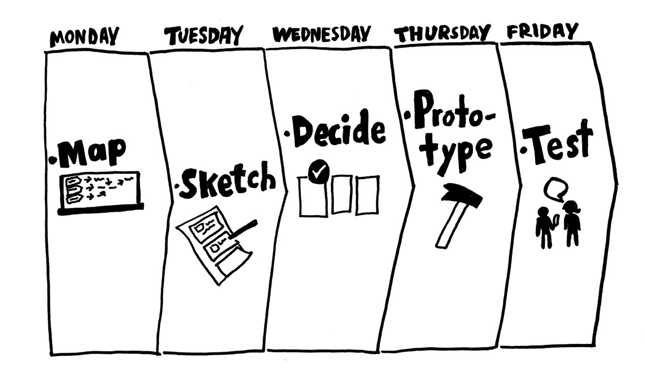
I had 2 weeks to analyse the UX of the existing app, prioritise the improvements and submit it for release. A small pod, formed to handle the cross functional responsibilities helped me plan the design sprint. We brainstormed solutions and aligned ourselves towards a unified goal.
Priority Matrix
All the bugs and improvements were bucketed into quadrants based on effort and impact. We then voted to shortlist the most important issues, giving a clear picture of the tasks to focus on for the next 2 weeks.
.jpg)
The Rebirth
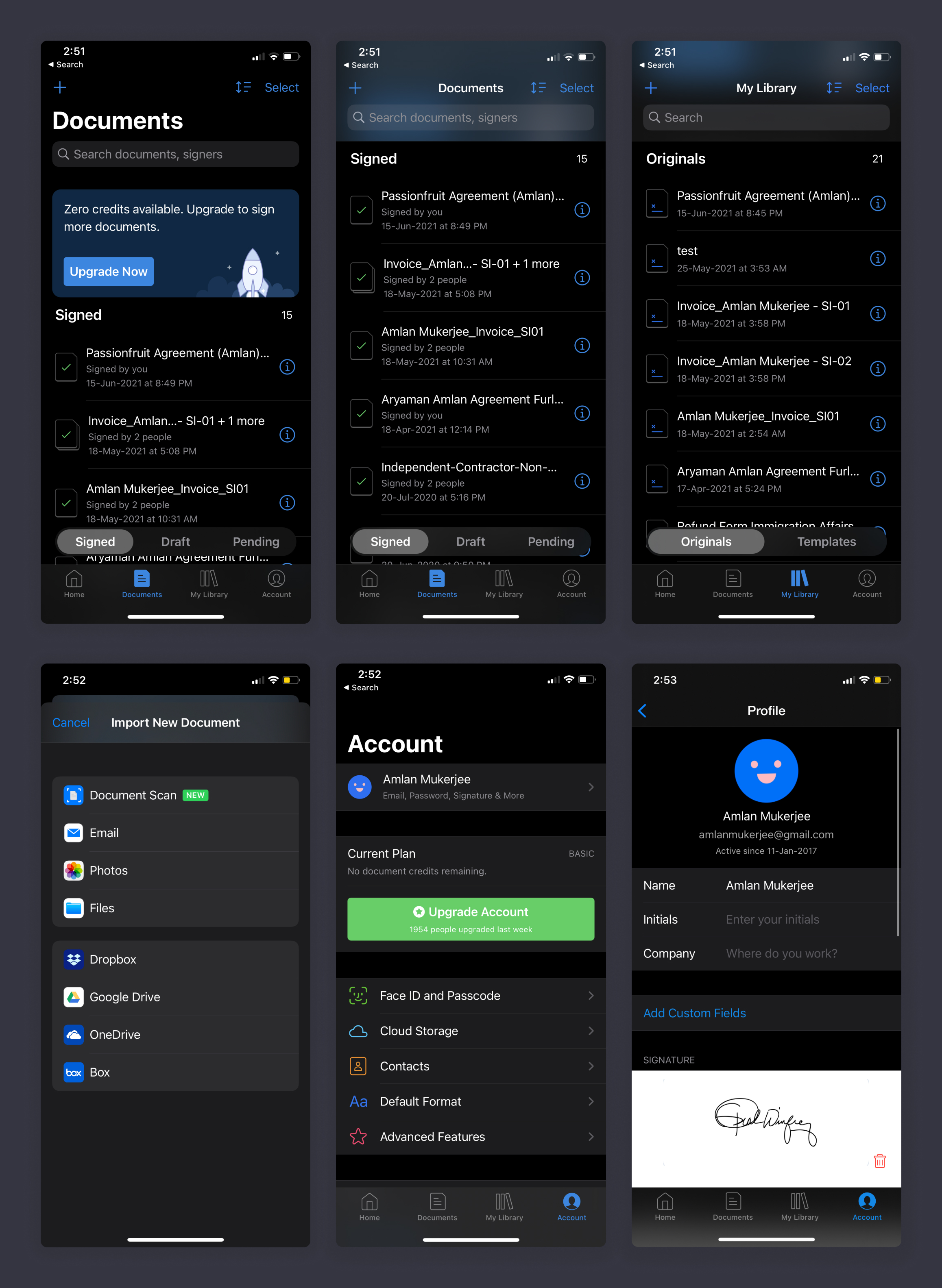
SignEasy's customer base ranges across all ages, 24 languages and various professions across the world - Freelancers, Actors, SMBs, Contractors, Banks, Sports Agents, Real Estate Agents, HR etc. The simplicity of the dynamic layout and robust information architecture scaled across multiple iOS devices. A powerful multi-tasking experience on iOS, regardless of how the app is used.
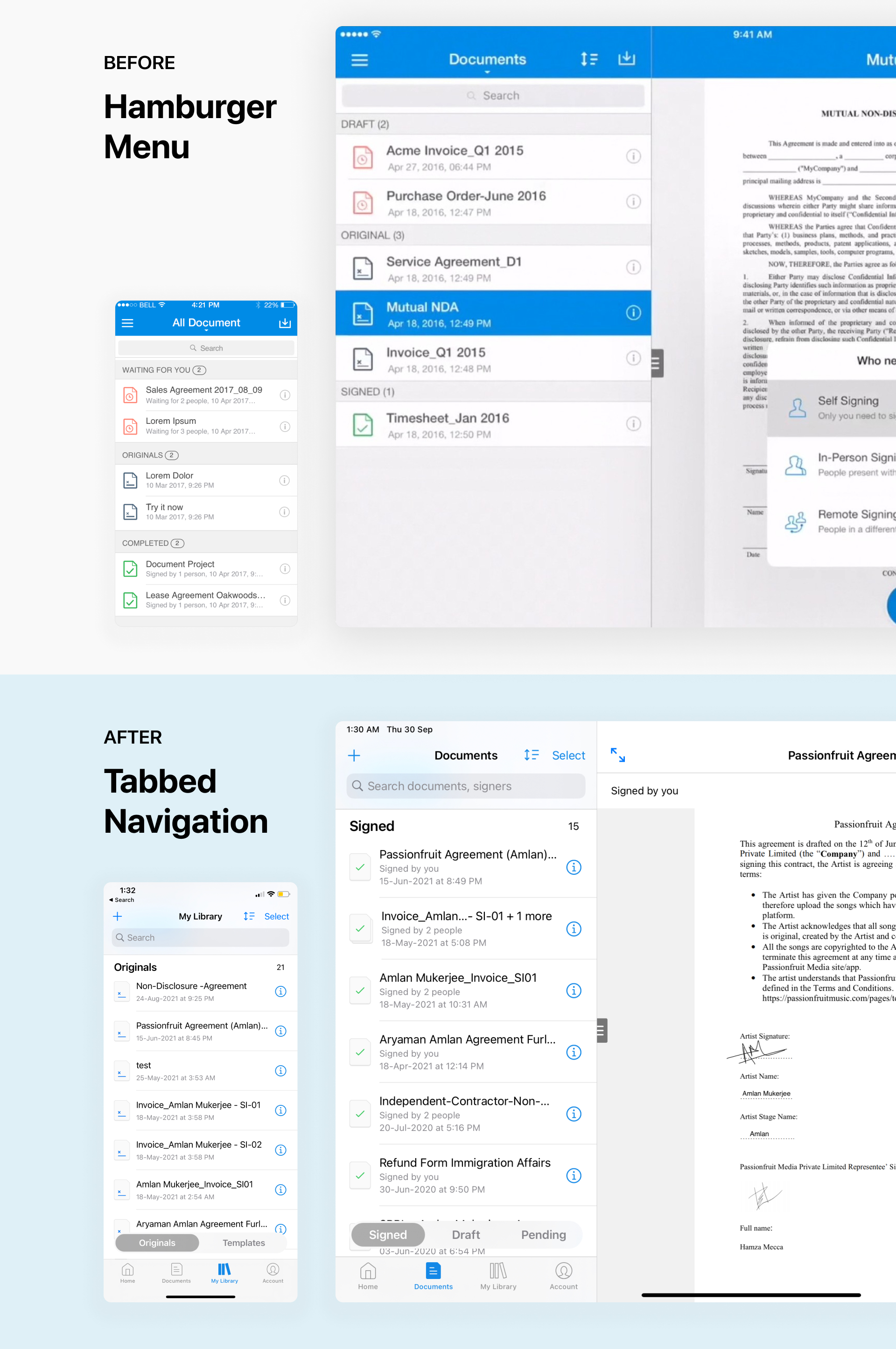
A simplified navigation and layout
The transition from a hamburger menu to a tab based navigation at the bottom, made the primary items naturally easier to discover and access across all devices.
My goal was to design an app which is accessible to all, irrespective of the demographics.
Clean and familiar UI components paired to form an elegant new aesthetic of the app. Designed solely for an easy & intuitive experience across all devices.
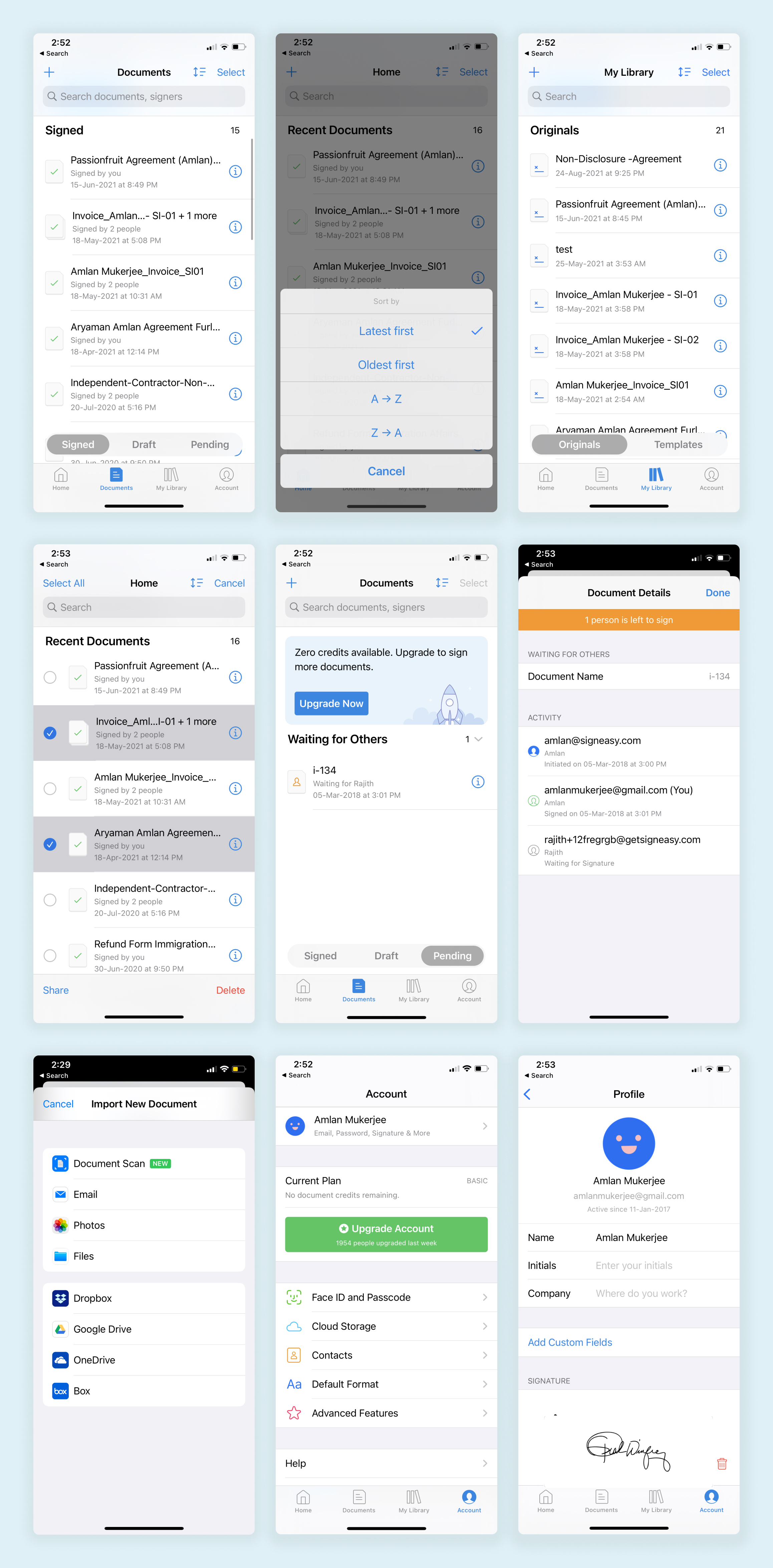
Visual Hierarchy and Iconography
Purposeful use typography, custom icons, colours and SF symbols improved the visual hierarchy and interactions for all screens.
Dark Mode
I also designed the app to be compatible with dark mode on iOS 13. A sleek and new look for the app.
Retrospect
Some of my key takeaways from the project are:
- Agility in decision making and teamwork, helped us meet our goal on time. The app was subsequently featured on the app store several times under the Business & Productivity category and App of the Day in multiple countries.
- The priority matrix helped the team focus on a unified goal
- The use of design patterns improved the ease of use and scalability of the design across devices. A balance between form and function.